Benjamin Franklin House - Discovery Room Games
Project Brief
Project Type:
Digital
Audience:
KS2, Formal Education
Aims:
Graphical & function update of exisiting concept, improve accessibility, future-proofing.
This was a very personal project for me as I was an Education Volunteer with Benjamin Franklin House when I came up with a proposal to revamp their DiscoveryRoom Games - though a major cross-country housemove, a few tech hiccups and some changes of direction would make it a touch more complicated than planned!
The Discovery Room games support the House's object handling sessions which are part of the education offer, part quiz part interactive activity, they invite students to explore objects from the handling collection to answer questions and explore their purpose.
Based on our experiences as volunteers using them during Education sessions, we knew there were a few changes we would love to see and a few bugs to be fixed as the games were starting to show their age a touch. They were a great tool to use during our object handling sessions and the students loved them, but we found ourselves avoiding certain games in order to run our sessions to time, and developing speed-running skills to-boot to reset any level that students hadn't had time to finish before the next group arrived.
About the same time, the House was just finishing part of an HLF project which had added some amazing images designed by Kremena Dimitrova to their education offer, so it seemed like an excellent time to take up the challenge of fixing up a few of those bugs and to take the opportunity to bring everything in line with the new look!
From the beginning of the project I was able to sit down and work with a few different members of the education team and my fellow volunteers at BFH to come up with a project brief that covered the areas we'd really like to see addressed:
To be fixed:
- Accessibility - new fonts, font sizes, and contrasting colours that made the games more accessible.
- Function - a few of the games just didn't work, or didn't fit with how the sessions worked.
- Usability - both the volunteers leading the sessions and the students participating found some of the UI and functioning of the games hostile, so we wanted to improvethe user experience for both sides.
- Accuracy - between questions the game would display factoids, a few of which hadunfortunately fallen prey to the "half-life of facts", we wanted to address that and use some more "shelf-stable" information.
- Learning Outcomes - to improve the learning outcomes of the quizzes and interactive levels.
- Hardware - we wanted to address some ageing hardware issues and ensure the longevity of the project.
As always things are never quite that simple! But by working closely (remotely) with Eleanor, Education Manager at BFH and the Education volunteers we managed to achieve those goals.
 Out with the old...
Addressing the first area - accessibility - was probably the easiest, the new look for the education sessions, with bright bold colours and collage-based practice, lent itself very well to the development of a style for both the quiz and gameplay sections of the software which employed a bold dyslexic friendly font and high contrast colours, which, paired with a pleasantly off white parchment-style background, hugely increased on-screen readability. Matching the games up to Kremena's style also allowed us to streamline the look of the software overall and increase the parse-ability of what was going on the screen (and let us leave behind some time consuming animated screen transitions – with a time-limited session, stealing a minute back is worth its weight in gold!).
Which leads us on to functionality, there were a few elements in the previous software that needed changing for some time, both small (those tedious transitions) and somewhat bigger (those habitually avoided games). Taking a careful look at how the games and quizzes functioned mechanically was part of our larger goal to improve the learning outcomes and ease a few pain-points when running sessions.
 ...in with the new!
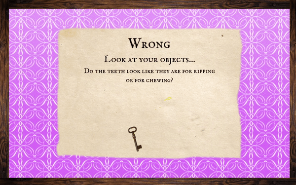 Soft fail-state - very on brand!
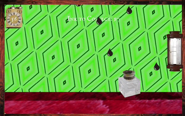 Inkwell
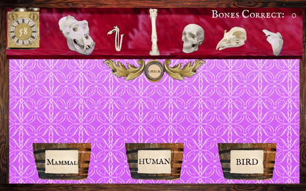 Keep trying!
We started by introducing a holding mechanic as part of a new soft fail-state (above left) in the quiz sections, this allowed us to introduce object handling prompts to help students engage with the objects and to counter problems that we'd noted as volunteers with students brute-forcing (press every option until you win!) their way through the quiz levels. These pauses leave room for the students to stop and think about the objects in their hands and give them guided questions to help shape their investigations of them.
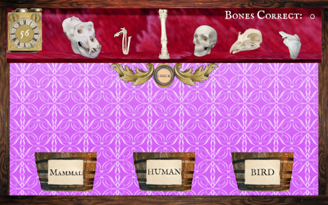
When it came to the more game-like levels, the changes we made game to game varied, from small improvements like introducing a counter in the Ink Drop level (above centre) which let students see their progress better and split their playtime between pairs more easily, to major mechanical changes for the Bone sorting game (above right), which introduced both in-game feedback and a second-chance mechanic which allows students to discuss and re-try their sorting decisions, rather than just receive the arbitrary Game Over the previous version gave them if they made even 1 mistake!
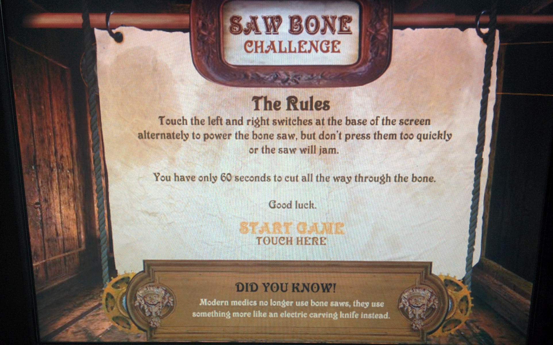
Of course, some games needed more practical work than pedagogical - it was not without some small personal satisfaction that I tackled the mechanical issues of our one, ritually avoided, unplayable level, though through the process it was interesting to divine exactly what had gone awry with the original.
Usability wise one of the key things I was keen to add was a "reset to start" function, it was one thing I particularly noticed as a volunteer, with limited time to run our sessions we were often left with half-finished games running when students moved on or had students who had started the wrong game for the object they had with no way to exit or restart - the only way out was through! We had all become pro-level speed-runners to move sessions along after these hiccups. Because of this, the number one usability change we added was a secret reset gesture that returns the game to the home screen. Paired with the newly streamlined UI it will make everyone's life a little simpler.
Hardware was a more challenging part of the project than anticipated, with compatibility and stability issues galore. Sometimes it really can feel like technology is against you but, working closely with BHF and their IT support, we were able to fight back. Originally we'd planned to develop the game to use the existing PC hardware in the Discovery Room, but the more we investigated the worse this solution started to look, future-proof it was not, and though we'd begun creating a custom Linux distro to try and get the best performance from the system possible, nobody was comfortable vouching for the hardware's longevity. So we pivoted production to creating an app that would work stably with a set of Android tablets BFH already had on hand. By choosing to pivot to the Android app we would have the flexibility we were looking for to be able to upgrade the OS and be compatible with newer devices. This kind of future-proofing was very much a core aspect of the project when we started, but I don't think any of us expected quite such a significant switch of platform to be part of the proceedings!
Testimonial:
Jenni has done a wonderful job of upgrading of our Discovery Room games which are a vital component of primary school visits to Benjamin Franklin House. Visually, the games are much more colourful and the graphics have been simplified. Functionality has also been improved which allows for students to engage with the games more independently. Throughout the development process, Jenni was a pleasure to work with and always responsive to feedback. She showed a real attention to detail and we are delighted with the final product. I would highly recommend Jenni to museums, heritage sites or libraries who are looking to develop engaging digital content.
~ Márcia Balisciano, Benjamin Franklin House